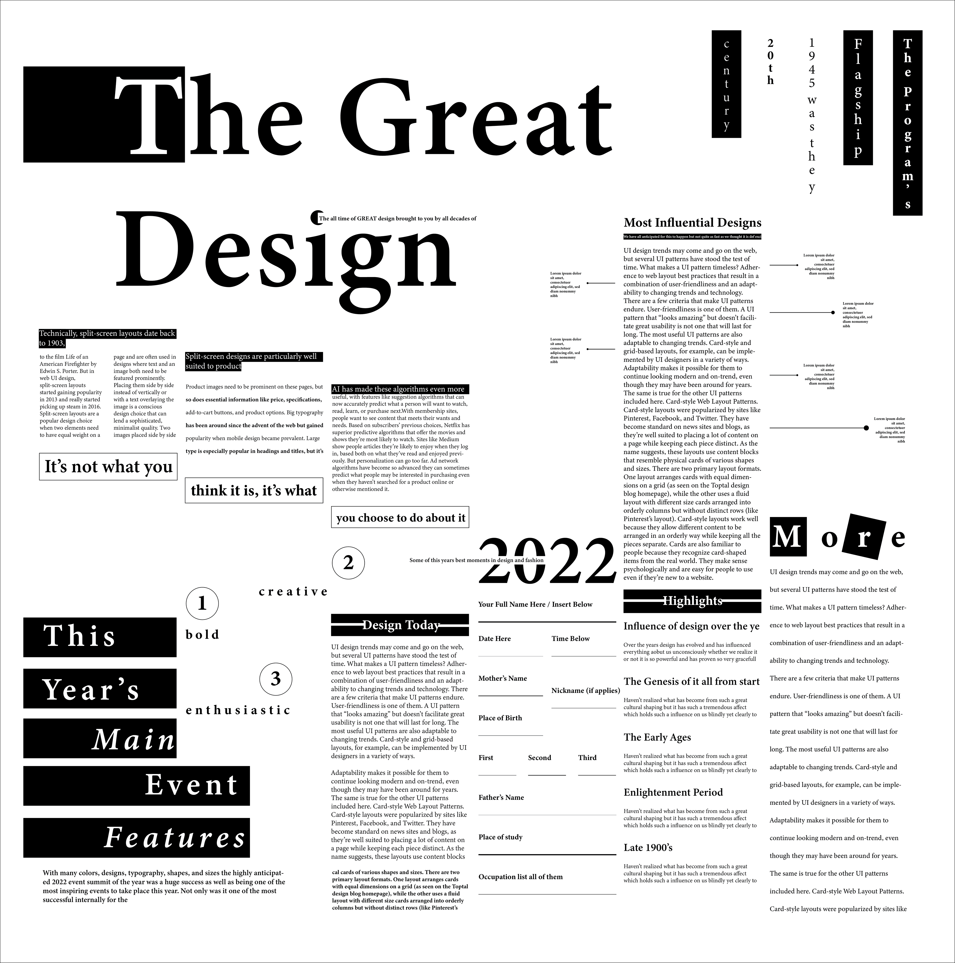
In the exploration of the relationship between grids and typography, I set out to challenge myself to create a poster in which the type can interact with each other in a complex and interesting yet understandable way. This conceptual poster is meant to discuss a design event in a slightly vintage newspaper style. It follows 6 columns, each column displaying more information about the event, topics such as the great influences, design and design styles throughout history that continue to shape our design creation and thinking today - suggested by the titles used. Each column features a slightly different typographic layout and style allowing me to experiment with how each one interacts with each other in a visual, practical and interactive way. The simplicity of black and white allows for the focus to be on the play of the typographic layout and how it sits within the grid potentially teasing the bounds of the grid testing how far I can go - essentially the poster is a visual breakdown of the experimentation purely of the relationship between typography and grids.