Poster design focusing on layouts and grid system
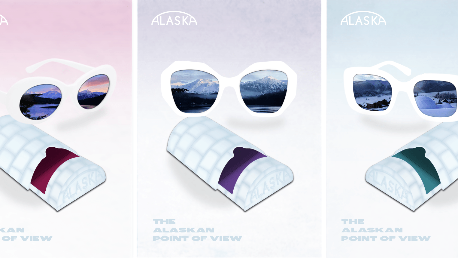
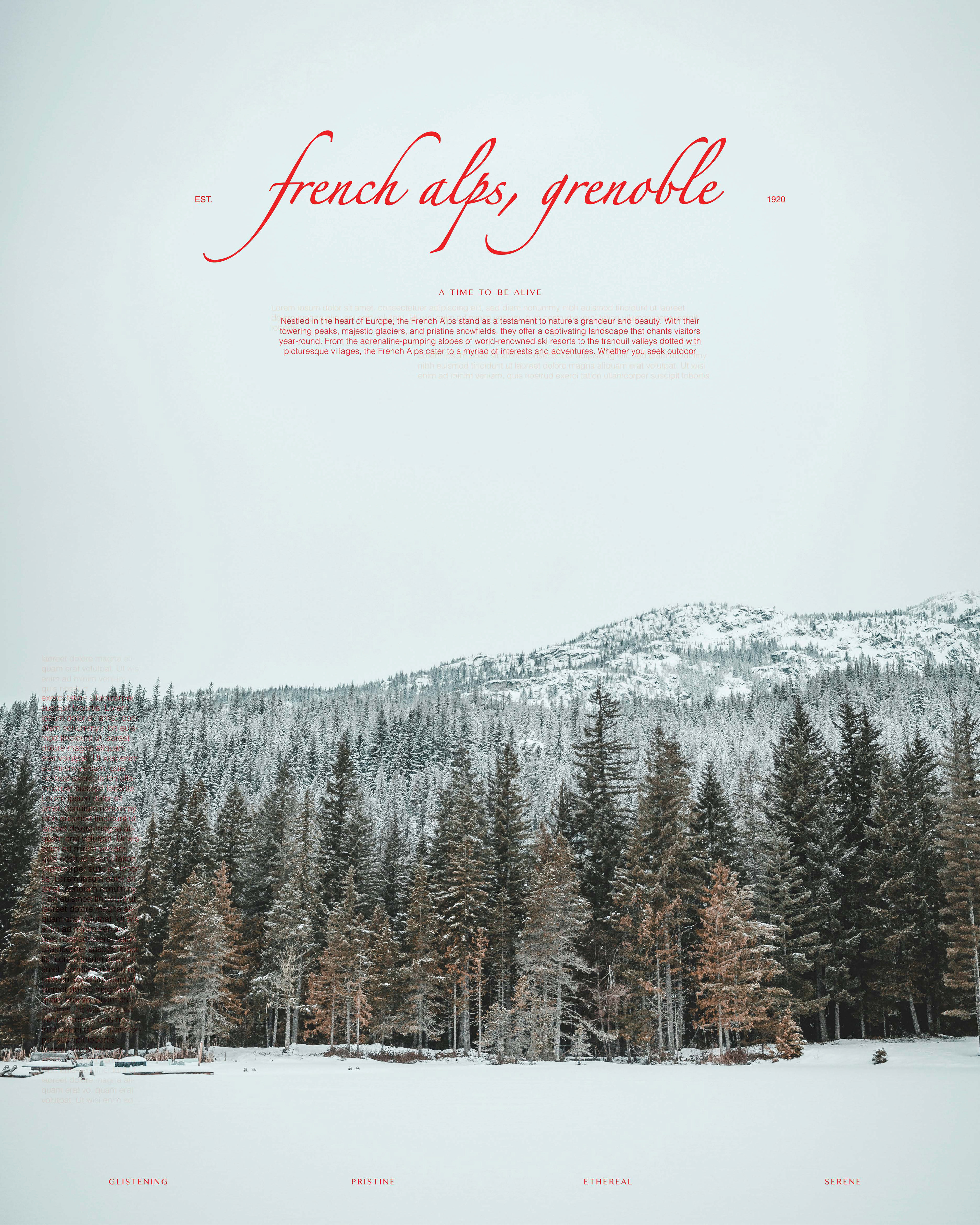
In this poster, I set out to practice type layouts with a grid system. I chose the French Alps with a quite frosted and cold tone. I contrasted that with a lively and rich pink color closely resembling a red, making it stand out starkly against the blue and green tonality of the snowed forest, while also keeping an almost stamped and a tarnished effect to showcase a postcard feel. The image was carefully chosen to showcase big cold empty spaces that would also serve as a strong ground for the vivid typography to stand out even more. The typography in the upper half is placed to construct a title, an opening, a welcome to the French Alps, again to refer back to a postcard look and feel -- as if the postcard serves as a welcome and a glimpse into the quiet yet exciting destination. The typographic paragraph on the left hand side of the poster serves as a clever visual illusion, playing off of the noise of the trees to amplify it further. The type has been extended from the paragraph in a lighter opacity to lend to the vintage postcard "dirty" feel. Finally, at the lower half of the poster comes four strong and solid typographic descriptive titles to solidify and tie all the elements together as a strong seal. Almost like an ending of some sorts. It starts off as a welcome, moves you through an experience, and brings you back to the strong and solid ending
I hope you enjoyed and maybe put you in the mood to visit the French Alps ;)